Banking App
Concept: everyday banking, made clearer
brief.json
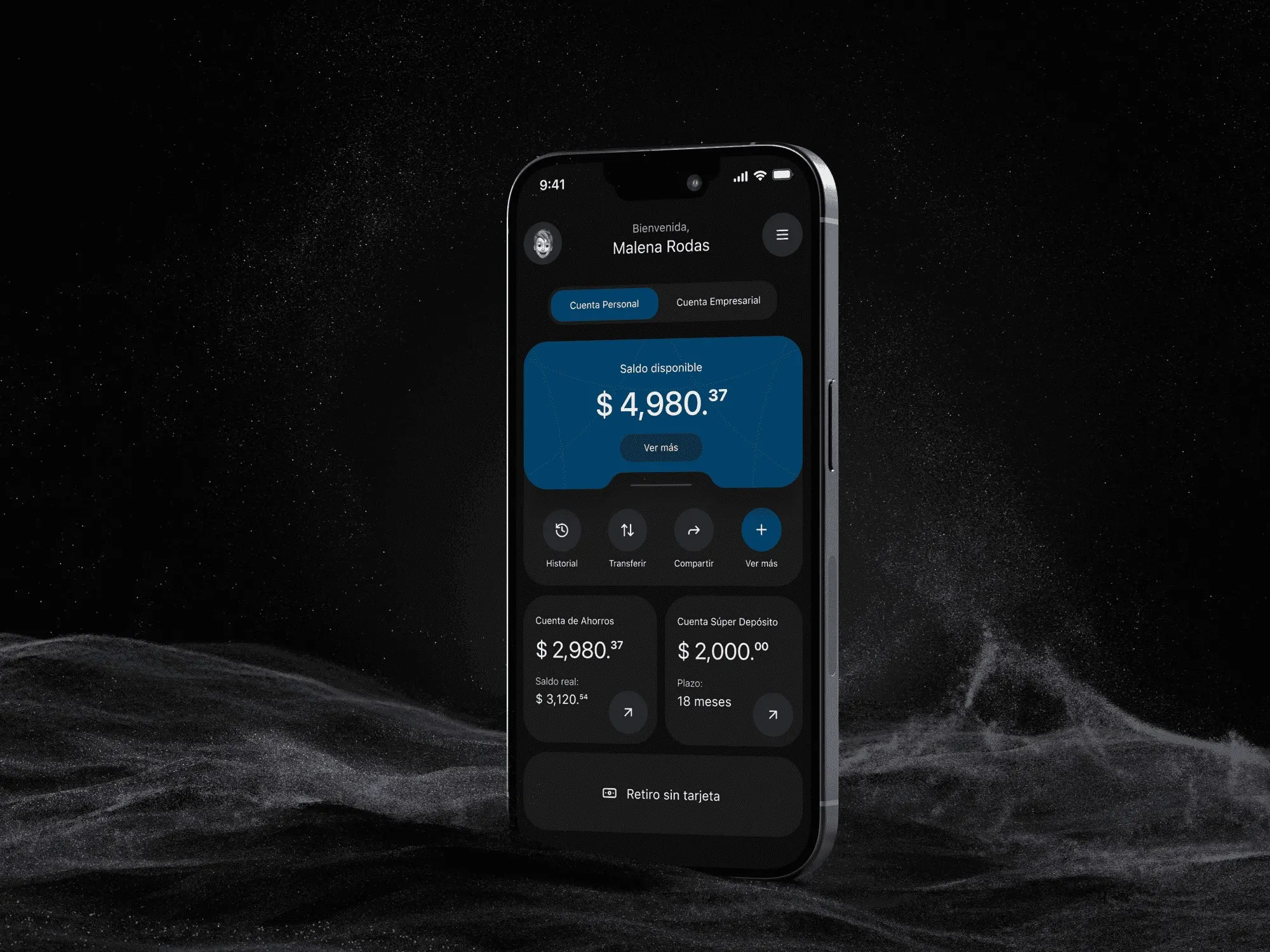
Personal project: I took a local banking app and redesigned it. I wanted everyday tasks to feel clear and fast: checking a balance, making a transfer and withdrawing cash without a card.
- Year
- 2024
- Client
- Concept project
- Industry
- Banking
- Duration
- 3 days
- Type
- Mobile app concept
UX audit & redesignMobile app design
Shown for portfolio purposes only. Brands belong to their owners; if you own it and want it removed, email me. Terms ↗
01The problem
Friction in the basics
Many local banking apps put needless friction into basic tasks like checking a balance or making a transfer. This concept came from that frustration. I wanted to show what thoughtful design can do for a tool we use every day.
02Design philosophy
Refine, don’t add
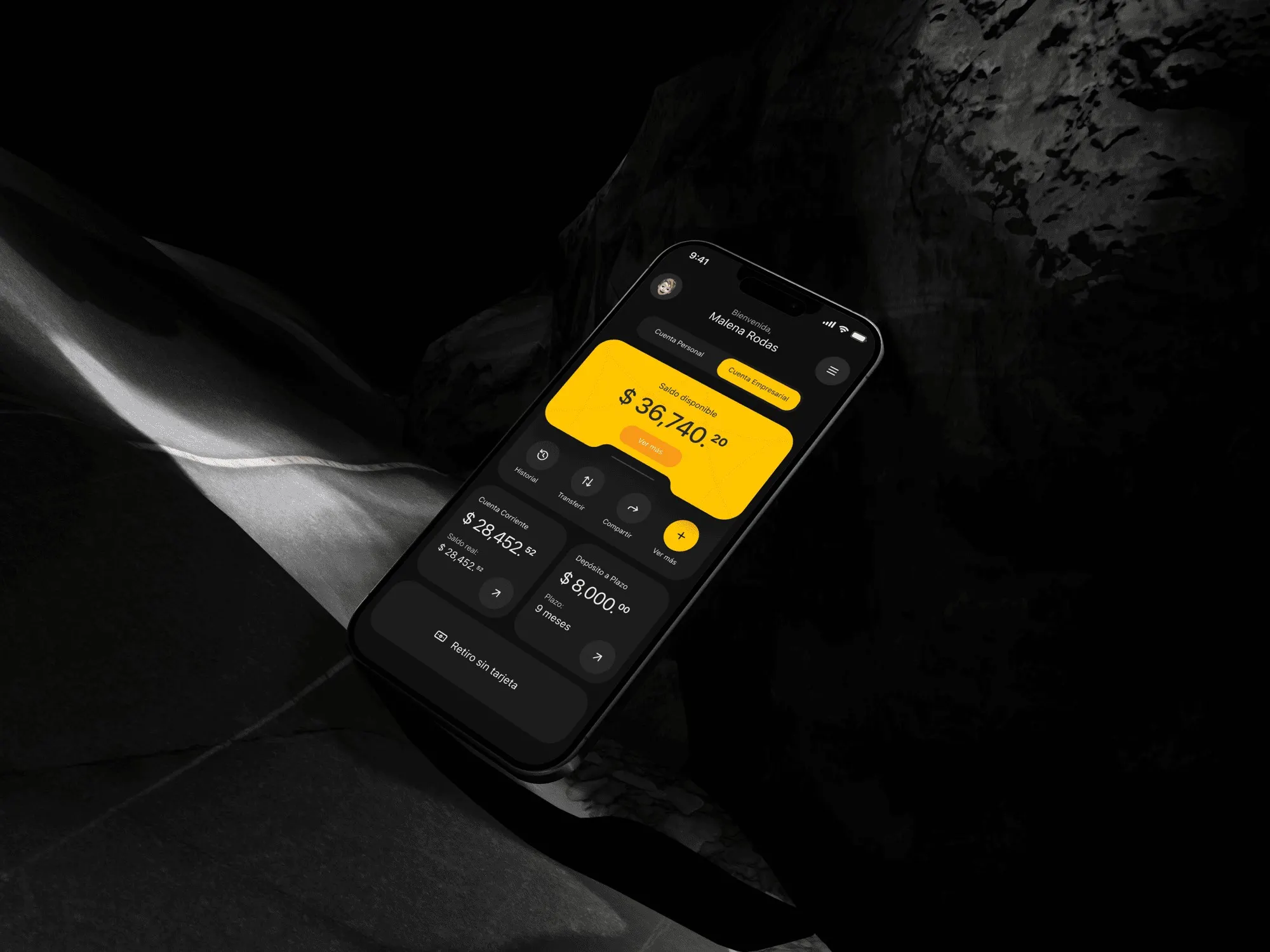
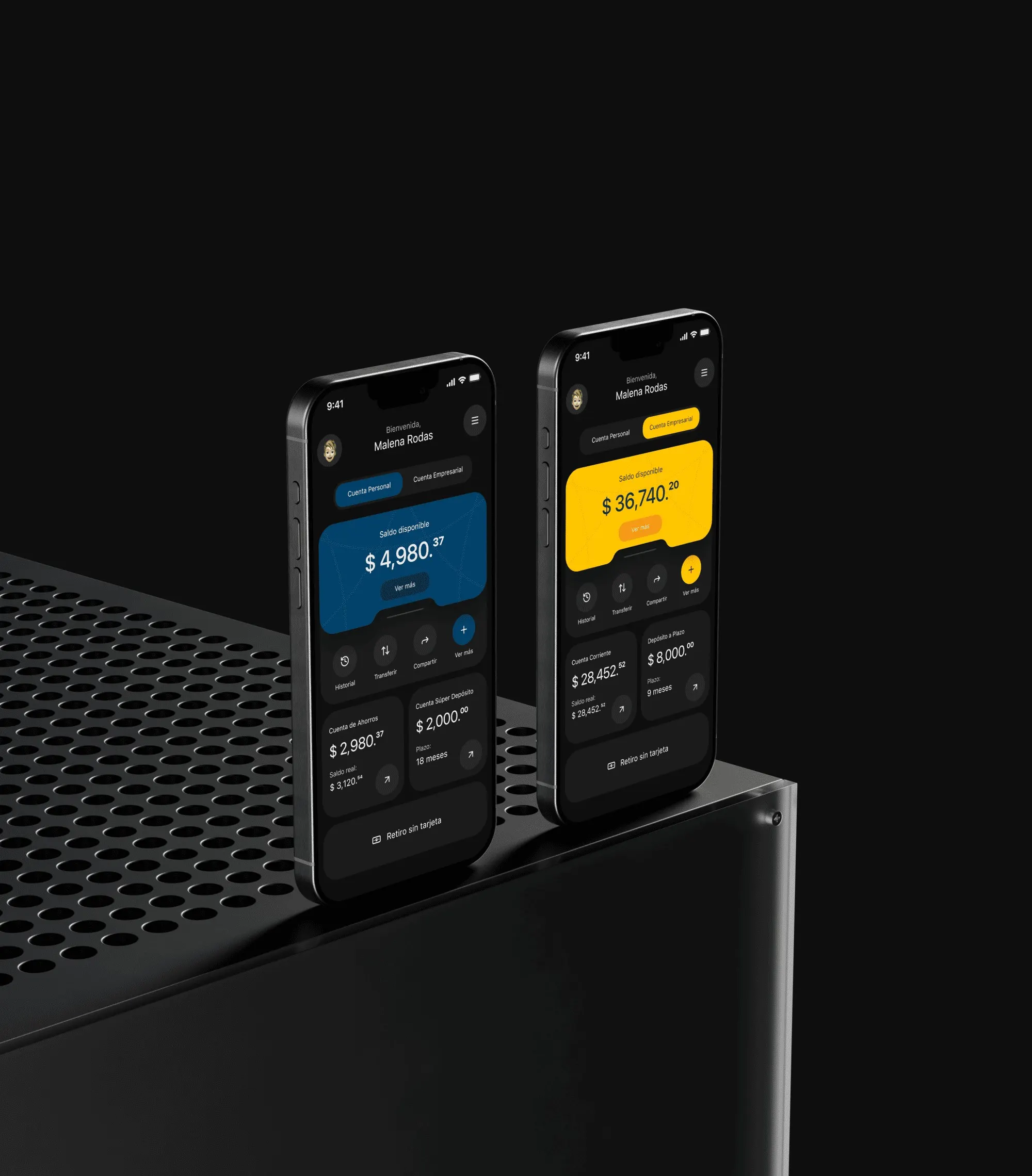
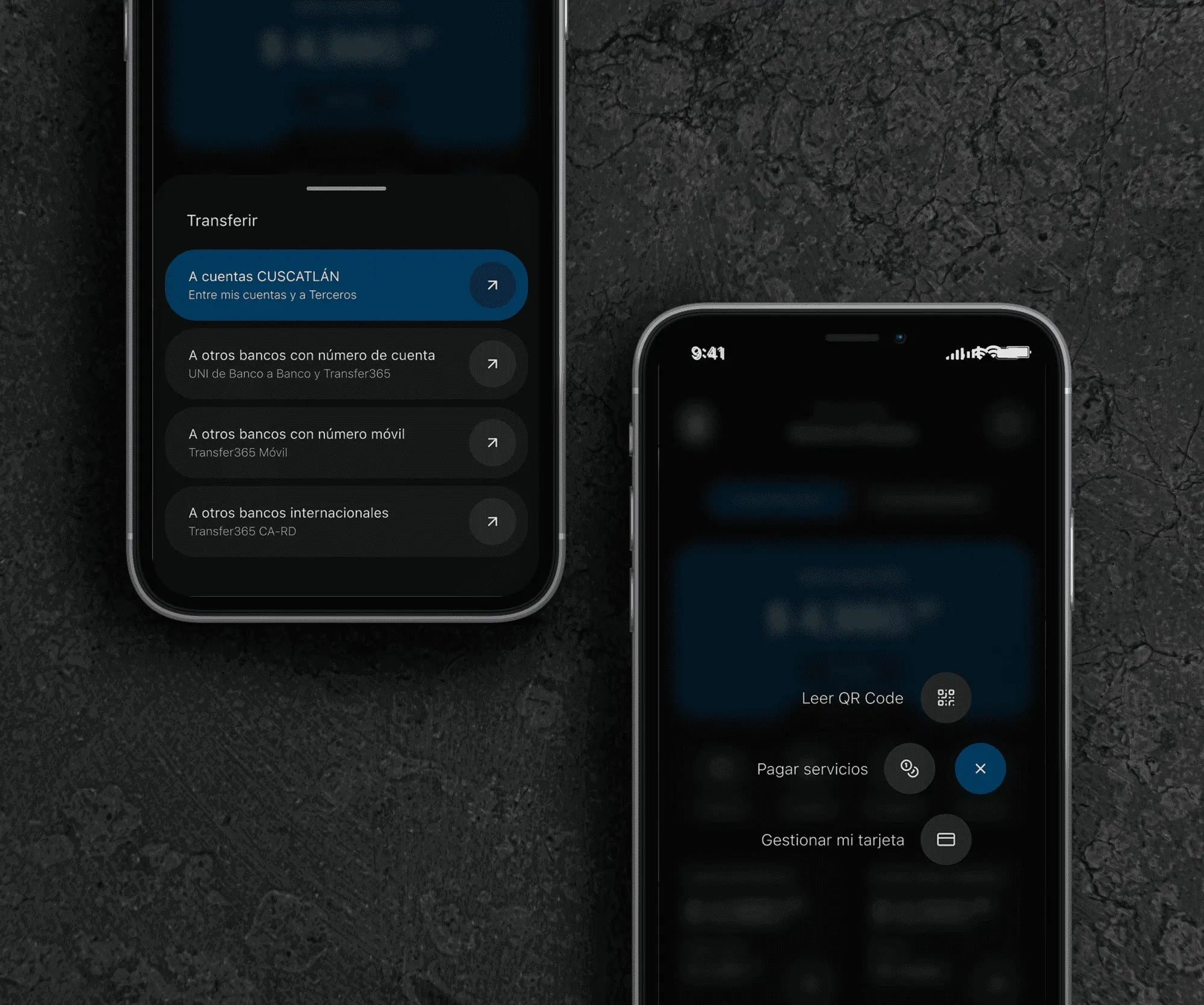
I chose to refine what already existed instead of adding features. I made the balance large and easy to read. I grouped the most frequent tasks in a quick-action bar: history, transfers and cardless withdrawals. I stripped out visual noise and redundant information.
03Visual system
Color with intent
I chose an elegant, more readable dark mode, with a clean sans-serif and minimal icons. I used color to tell accounts apart: blue for personal and gold-yellow for business. It’s a clear distinction that conveys security.
The closest matches to this case come first. Use the arrows to browse the rest.