Bennu
Fintech redesign with a design system built from scratch
brief.json
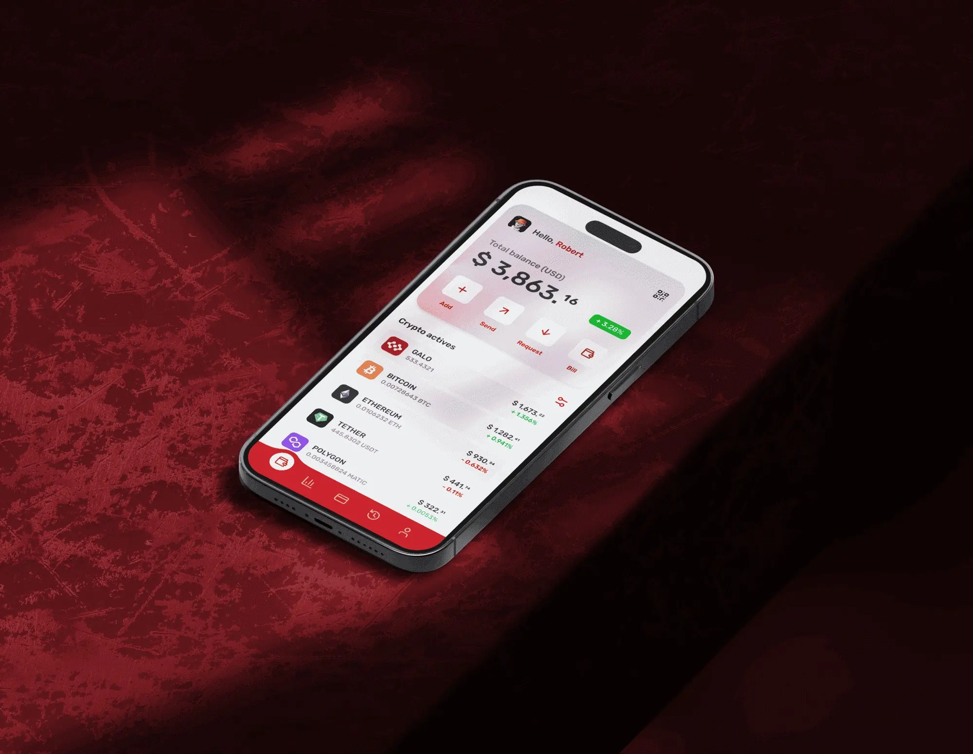
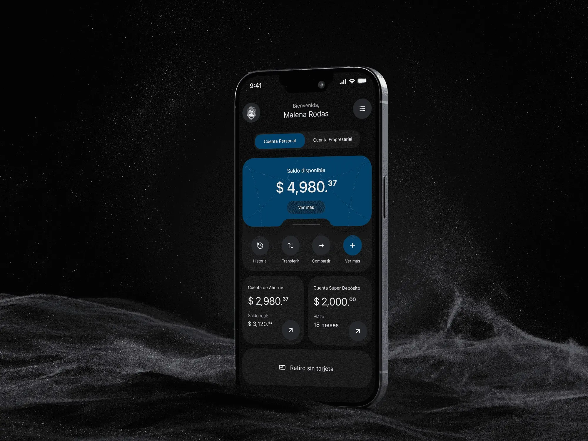
I led the redesign of Bennu, a fintech app for managing global finances. I restructured the experience and built a design system from scratch for coherence, scale and trust.
- Year
- 2024
- Client
- Bennu
- Industry
- Fintech
- Duration
- 5–6 weeks
- Type
- Mobile app redesign
UX audit & redesignMobile app designDesign system
Shown for portfolio purposes only. Brands belong to their owners; if you own it and want it removed, email me. Terms ↗
01Challenge
Powerful tools, messy experience
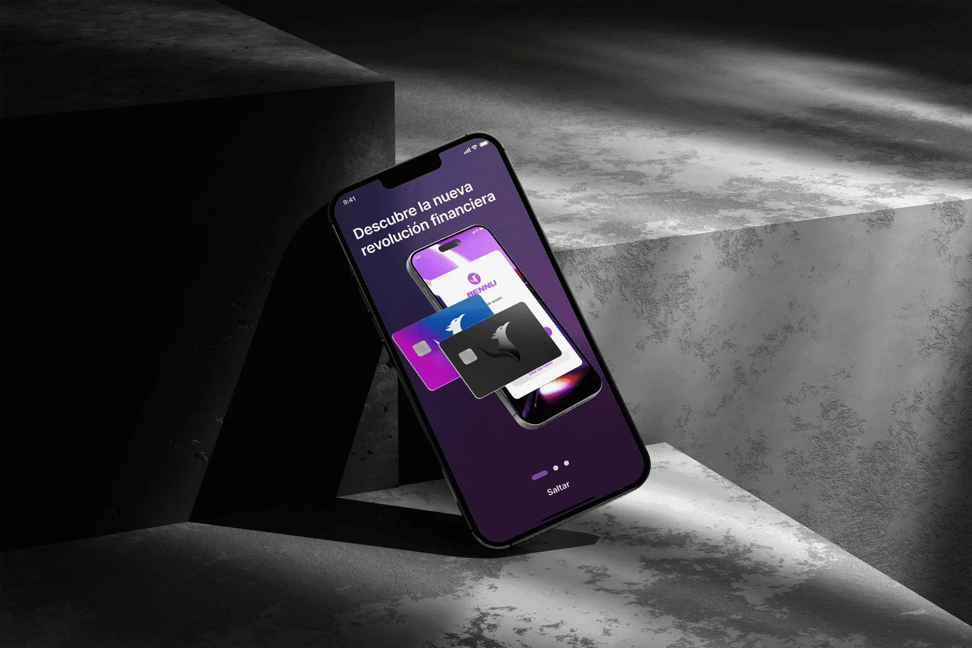
Bennu had powerful financial tools, but the app was inconsistent and the navigation overwhelmed people. In fintech that breaks trust. A facelift wasn’t enough. The experience had to be restructured, from multi-currency accounts to asset investments.
02Design system
Fixing it at the root
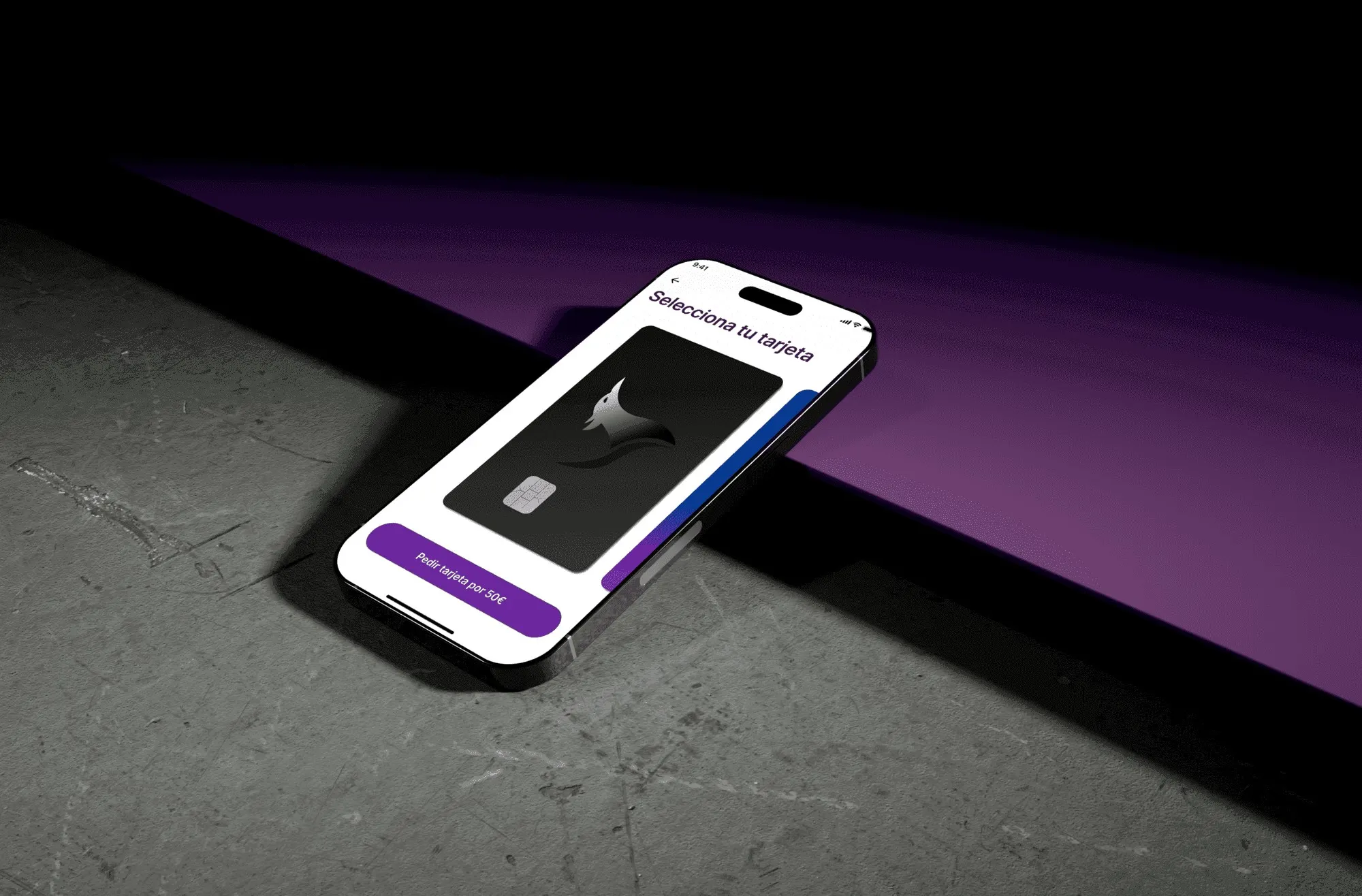
So the inconsistencies wouldn’t come back, I built a complete design system. I documented guidelines for type, color, components and interaction patterns. It’s a single source of truth. The goal is for every new feature to stay coherent and for the team to ship faster.
03User experience
Fewer steps where it counts
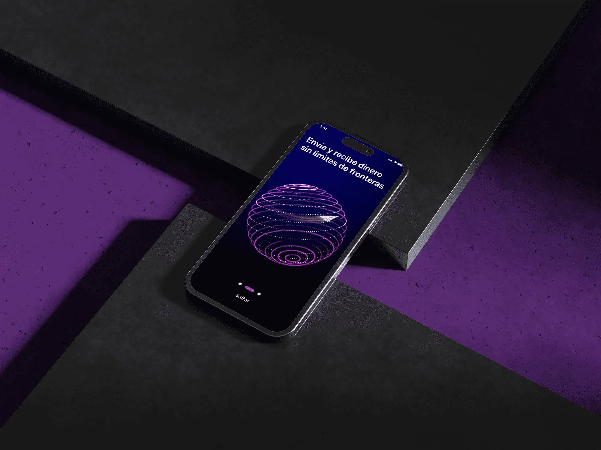
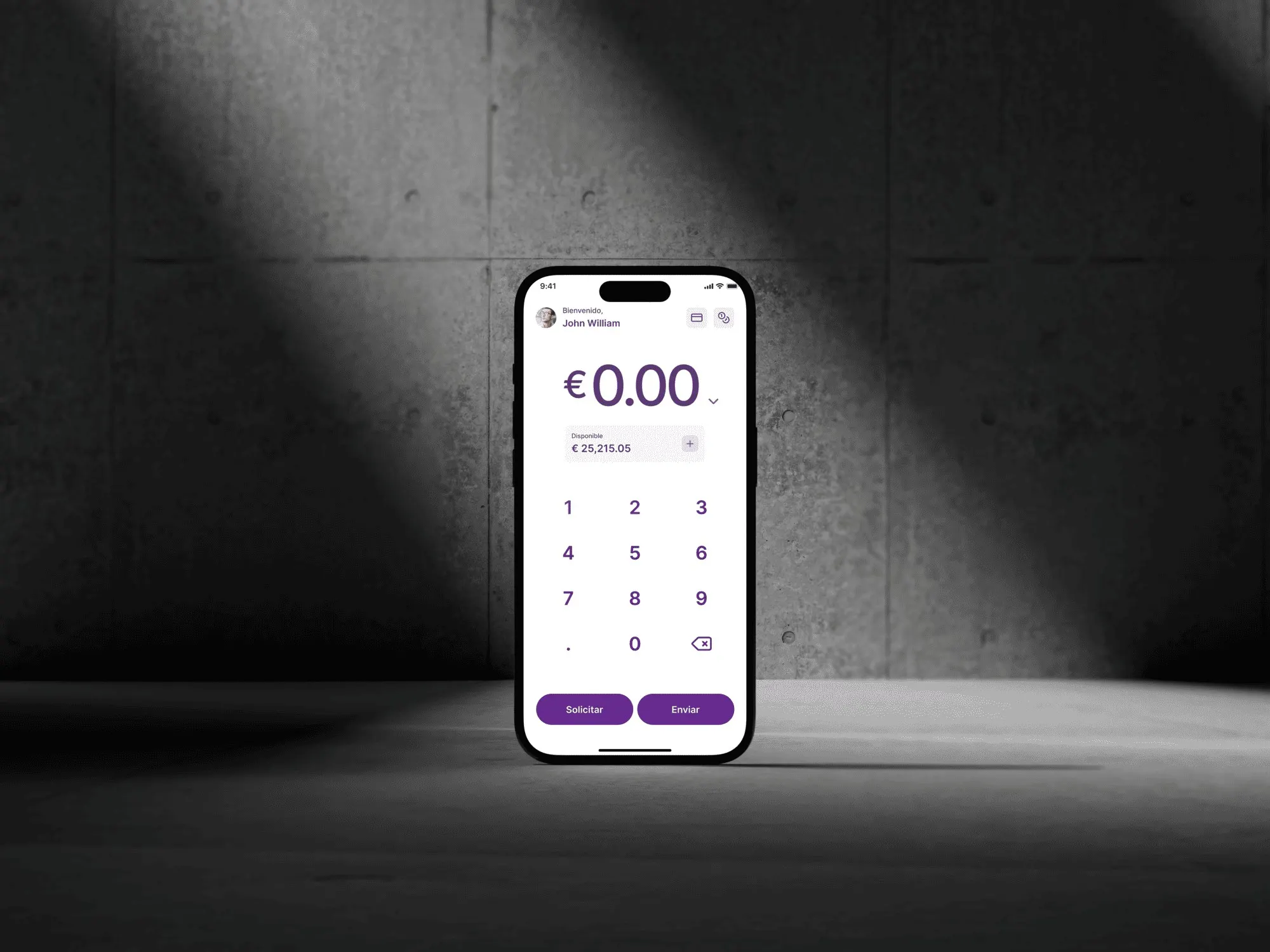
I mapped the core journeys: sending money, exchanging currency and managing cards. Then I cut the steps and decisions that weren’t needed. The international transfer, for example, became three steps with a clear confirmation at each one.
04User interface
Color only where it decides
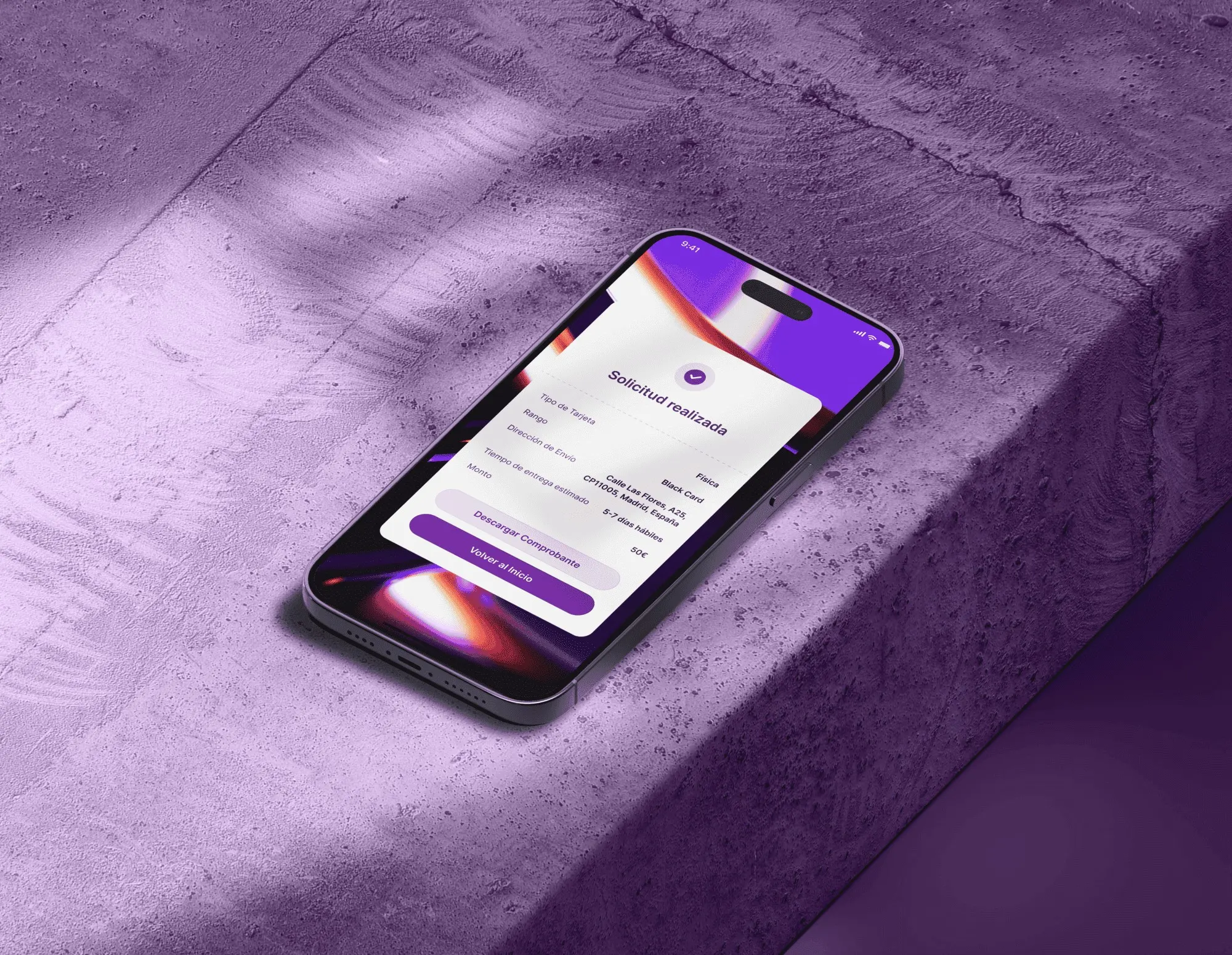
I chose a white background for openness. I kept Bennu’s purple for primary actions, active states and virtual cards. I used large, rounded type. I also added moments of positive reinforcement to build confidence. One of them is the full-screen check after a successful transfer.
The closest matches to this case come first. Use the arrows to browse the rest.